FRIDAY 7CARE
A brand system rebuild for a baby products line—compliant packaging, refreshed illustrations, and scalable Amazon assets designed around safety and trust.
Friday 7Care had a logo, a font, and a product line parents genuinely needed—but a brand system that was making it harder to sell. I built the cohesive visual language they were missing: a refreshed illustration style, compliant packaging, and a scalable Amazon asset framework designed around safety, clarity, and trust.
My Role:
Art Direction, Illustration, Packaging, Graphic Design
Client:
Friday 7Care / Infinite Commerce
Team:
Senior Art Director (myself), Production Designer, Copywriter, Legal/Compliance Counsel, Photographer, Brand Manager
Scope:
4 SKUs
Timeline:
2 Months


The Problem
Baby and family products live or die on trust. Friday 7Care's existing branding was inconsistent and visually dated—and their packaging had a more serious problem: it featured unlicensed artwork and didn't meet children's product regulations. The logo and brand font had to stay. Everything else needed to be rebuilt from the ground up, with no lifestyle photography budget and a legacy illustration style that was more clunky than charming.
What I Did
Built the brand system before producing any final assets, using placeholder visuals to get stakeholder sign-off on direction first. Collaborated with a copywriter to ground the visual decisions in a clear brand story centered on safety and reliability.
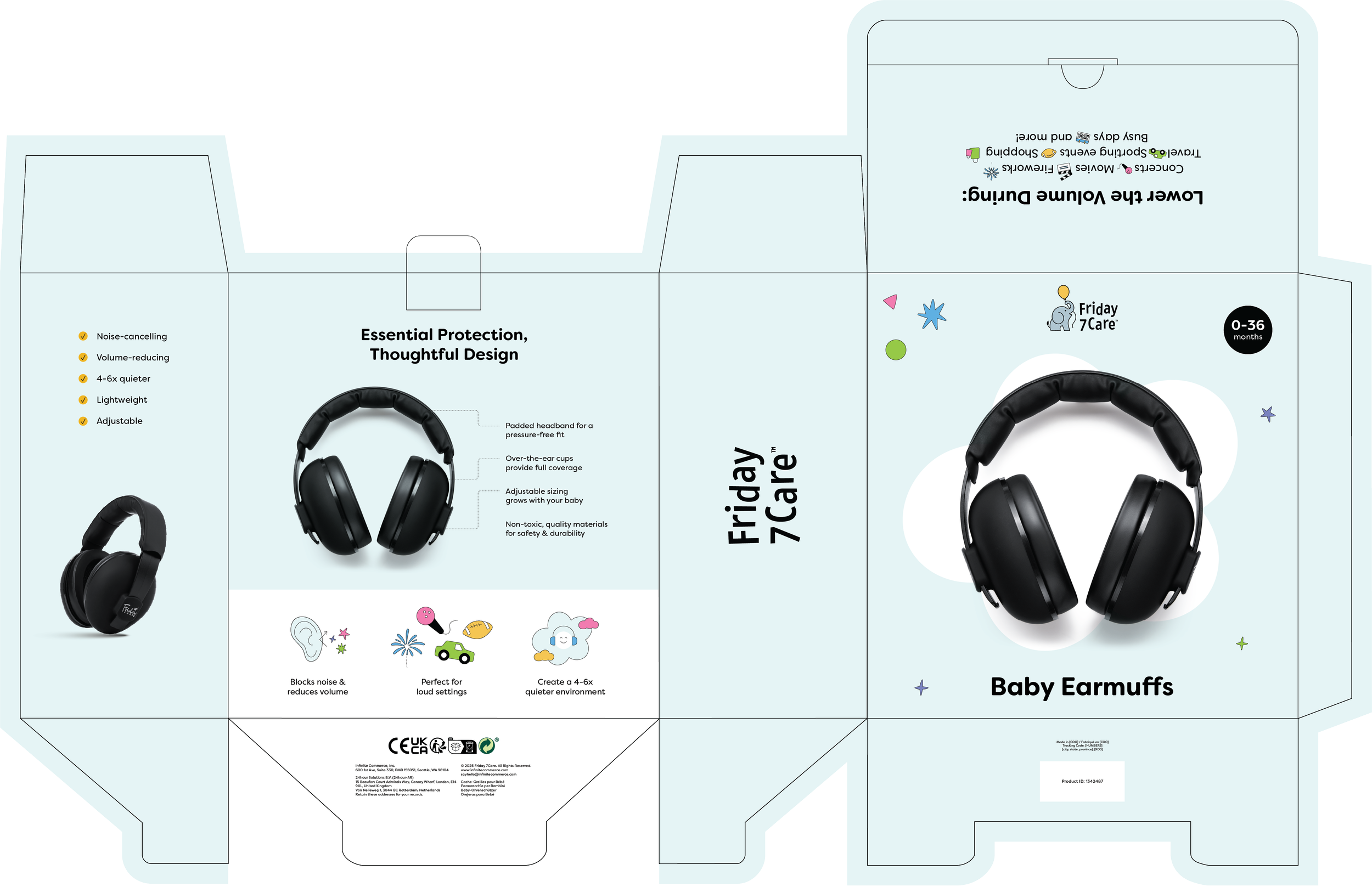
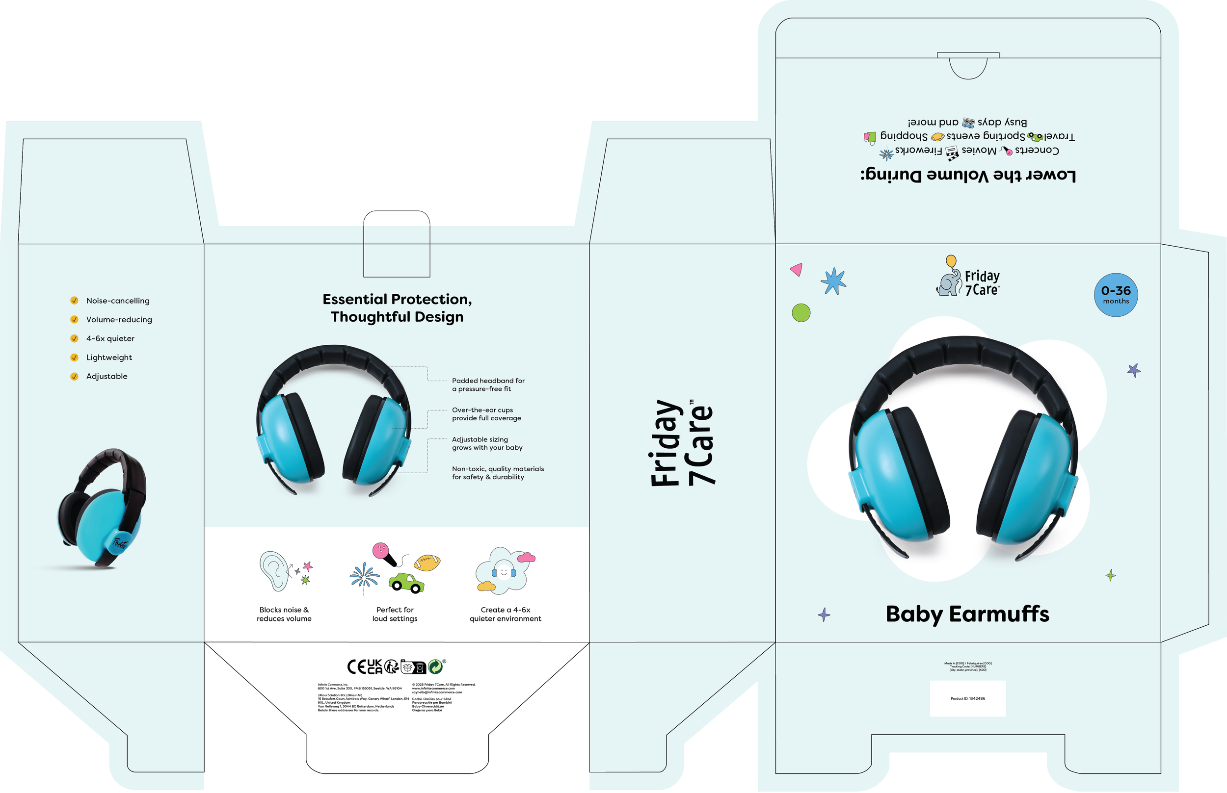
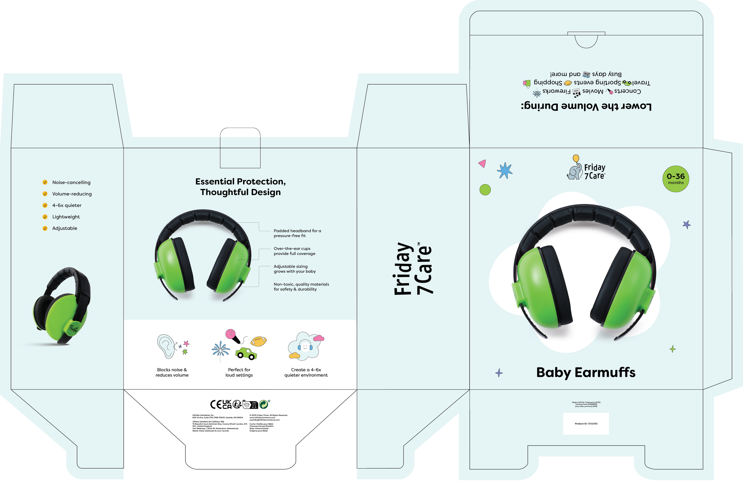
Refined the illustration style to be cleaner and more contemporary while keeping a thin black outline for brand continuity. Designed packaging templates and Amazon assets—PDPs, A+ content, storefront, and brand story—as a reusable system, so applying it to new SKUs was a matter of execution, not redesign.
Result
A production designer was able to extend the system to remaining SKUs independently, with consistent output. The framework now serves as the foundation for future packaging updates, listing optimizations, and marketing materials.
Built to pass the fifth SKU test, not just the first.
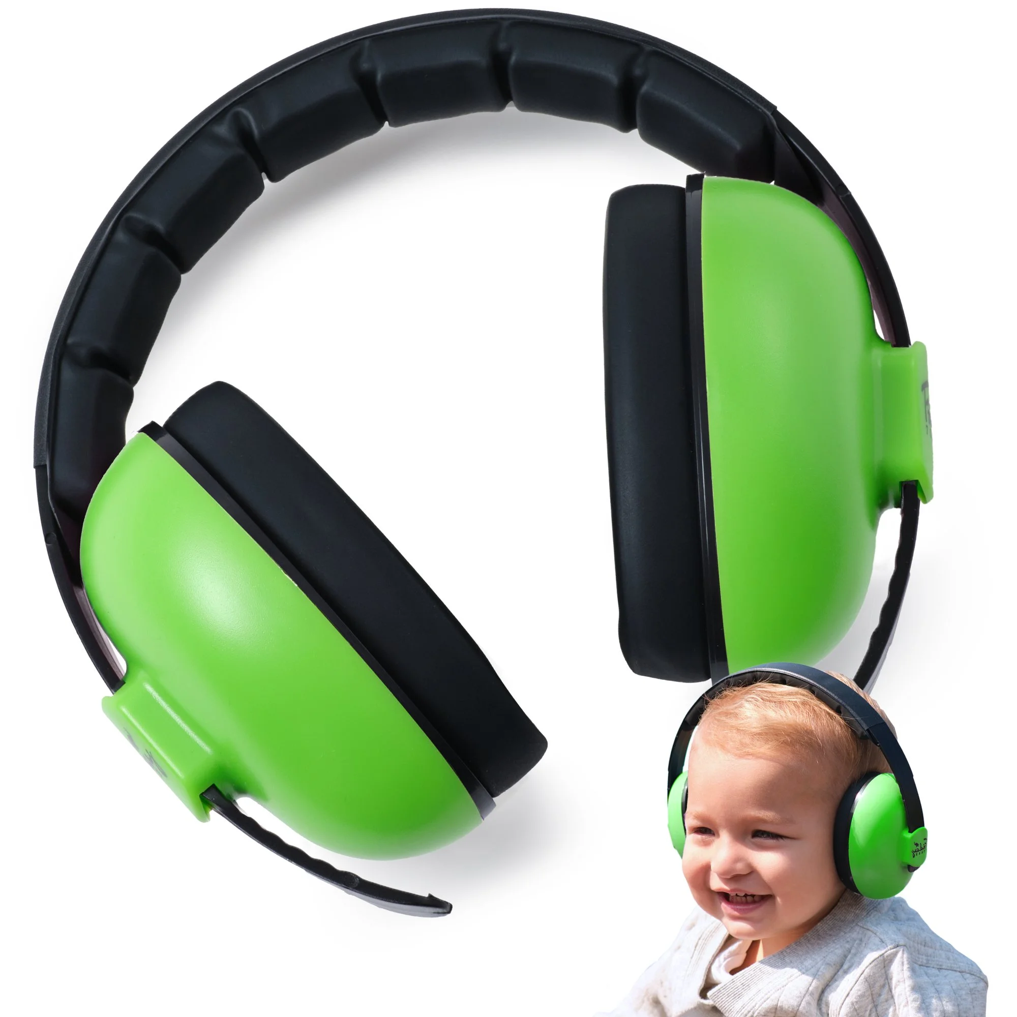
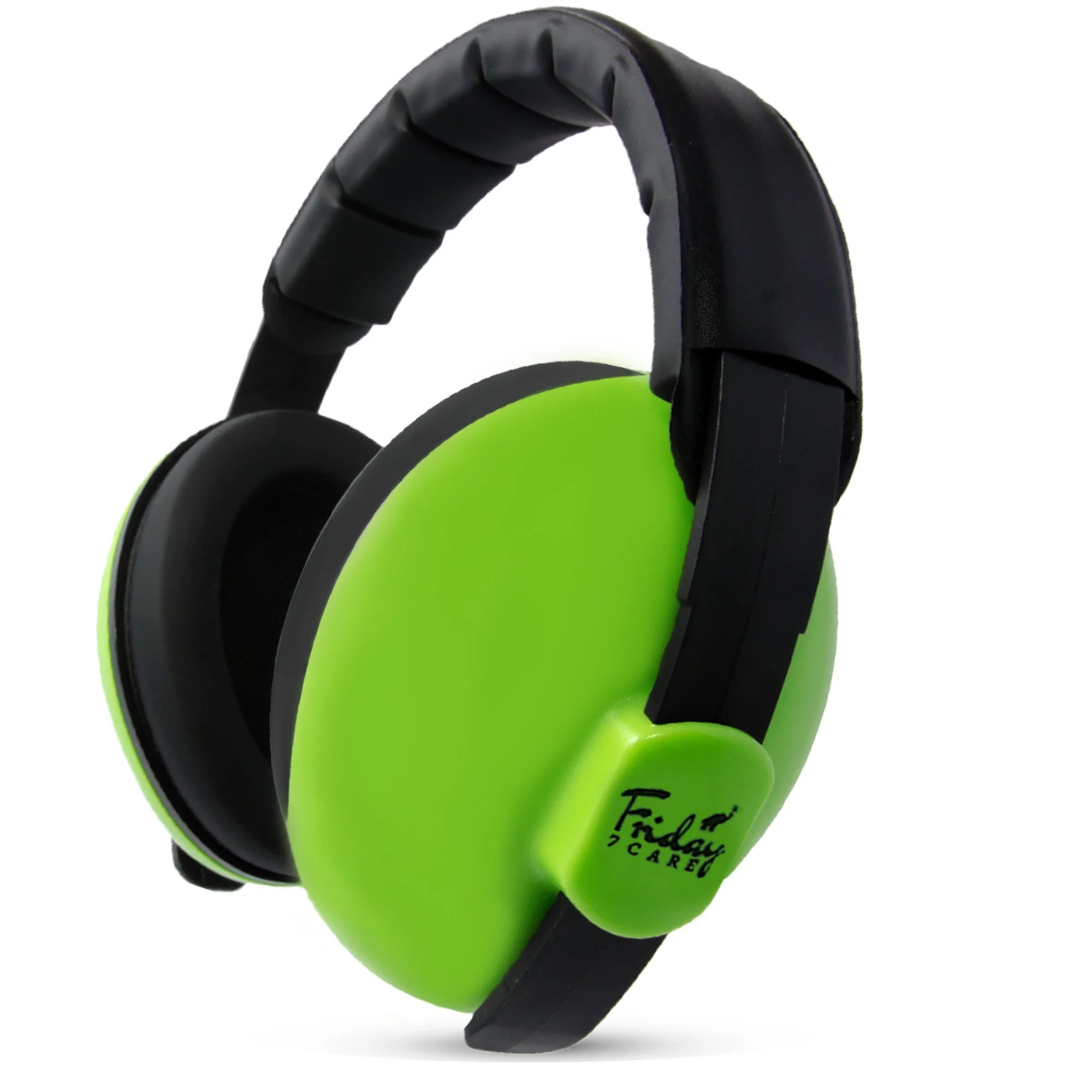
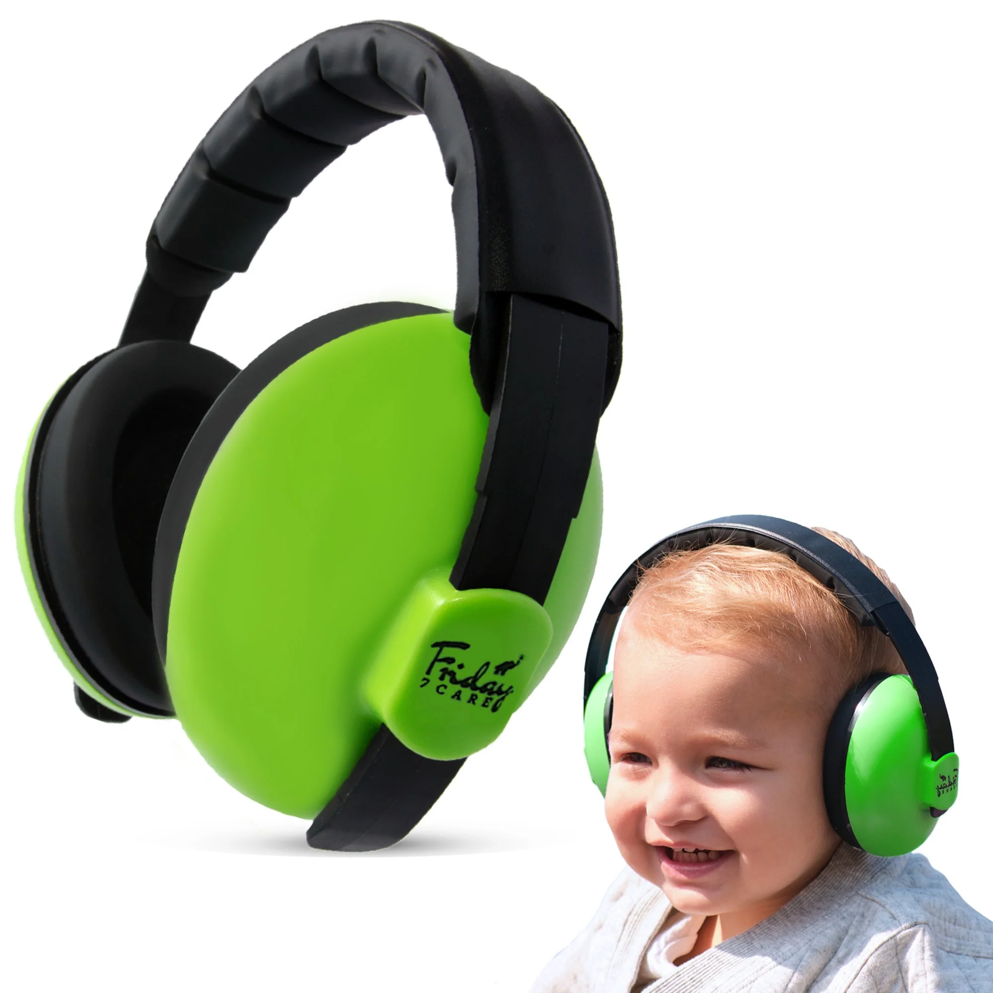
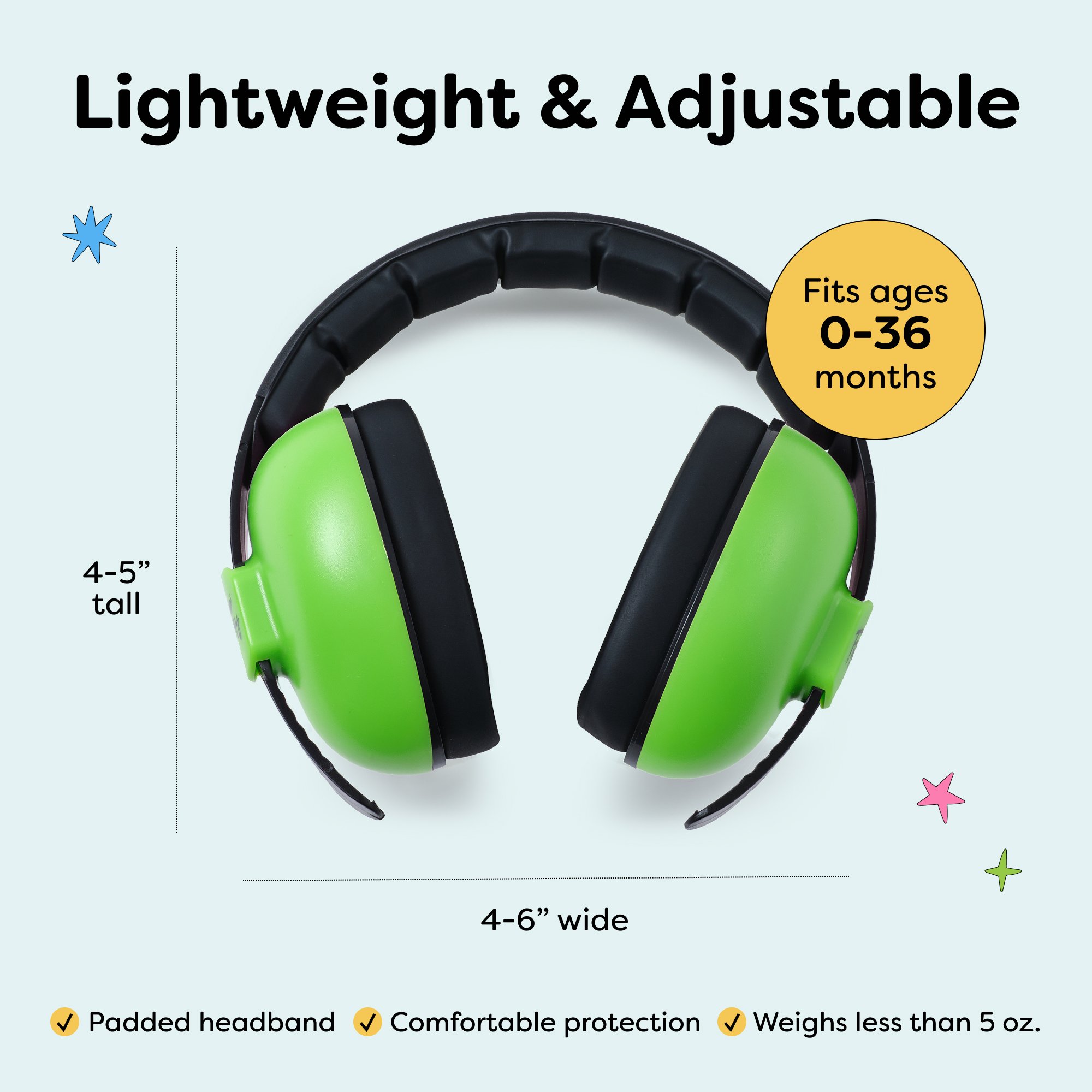
New illustration style for Friday 7Care:


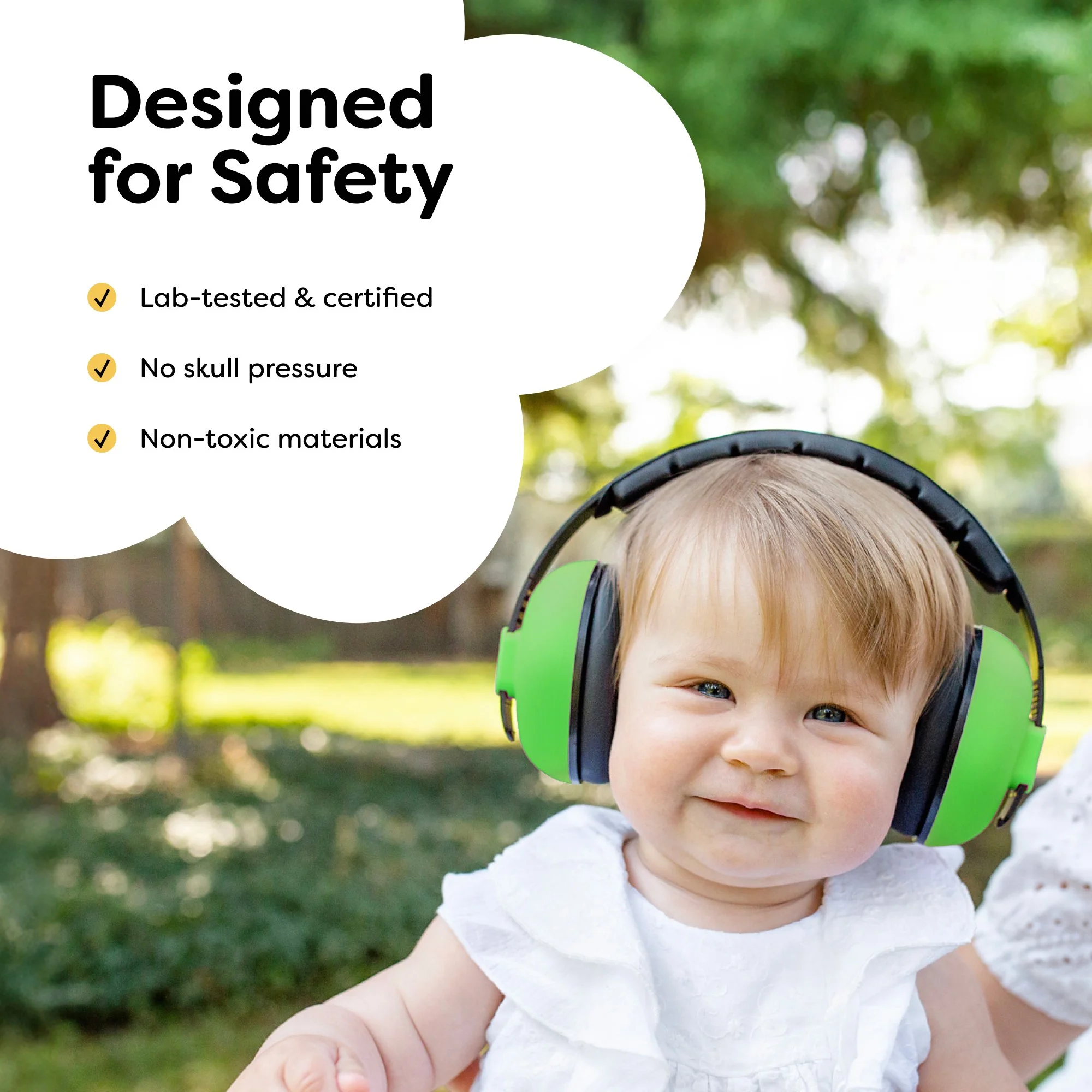
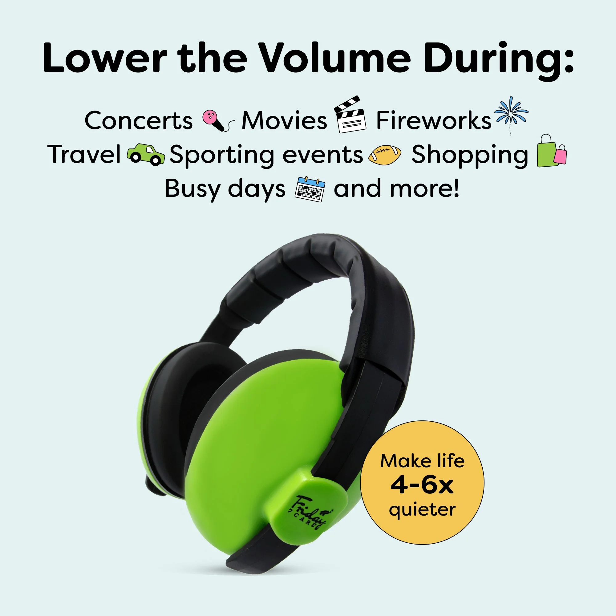
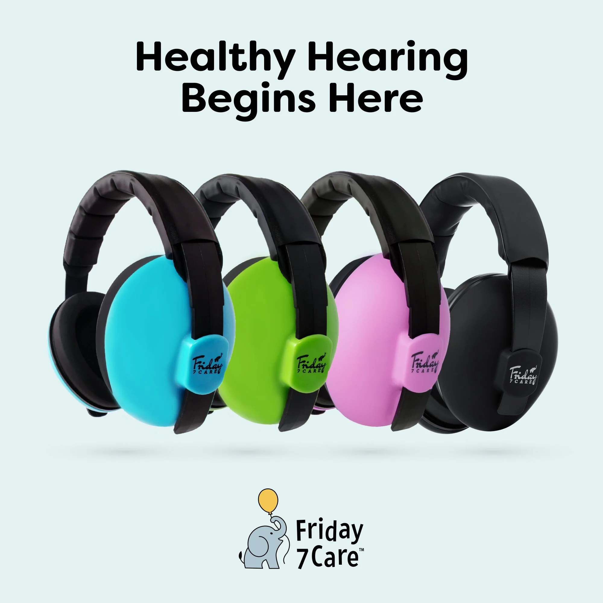
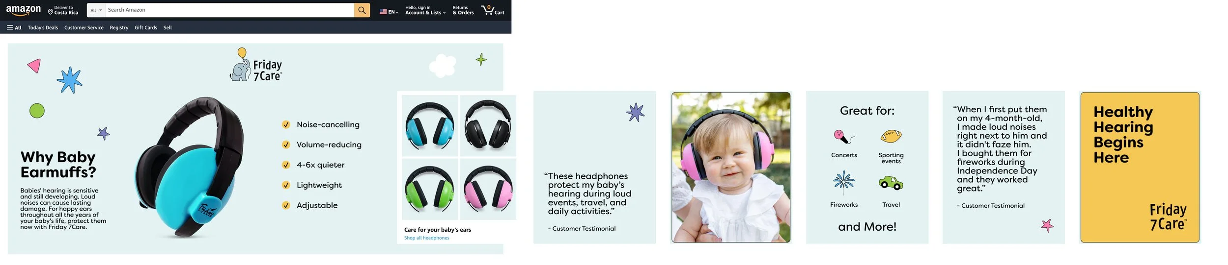
Friday 7Care PDP refresh:
Amazon PDP template for Friday 7Care’s SKUs with main image A/B test options:

Updated packaging design for all SKUs:
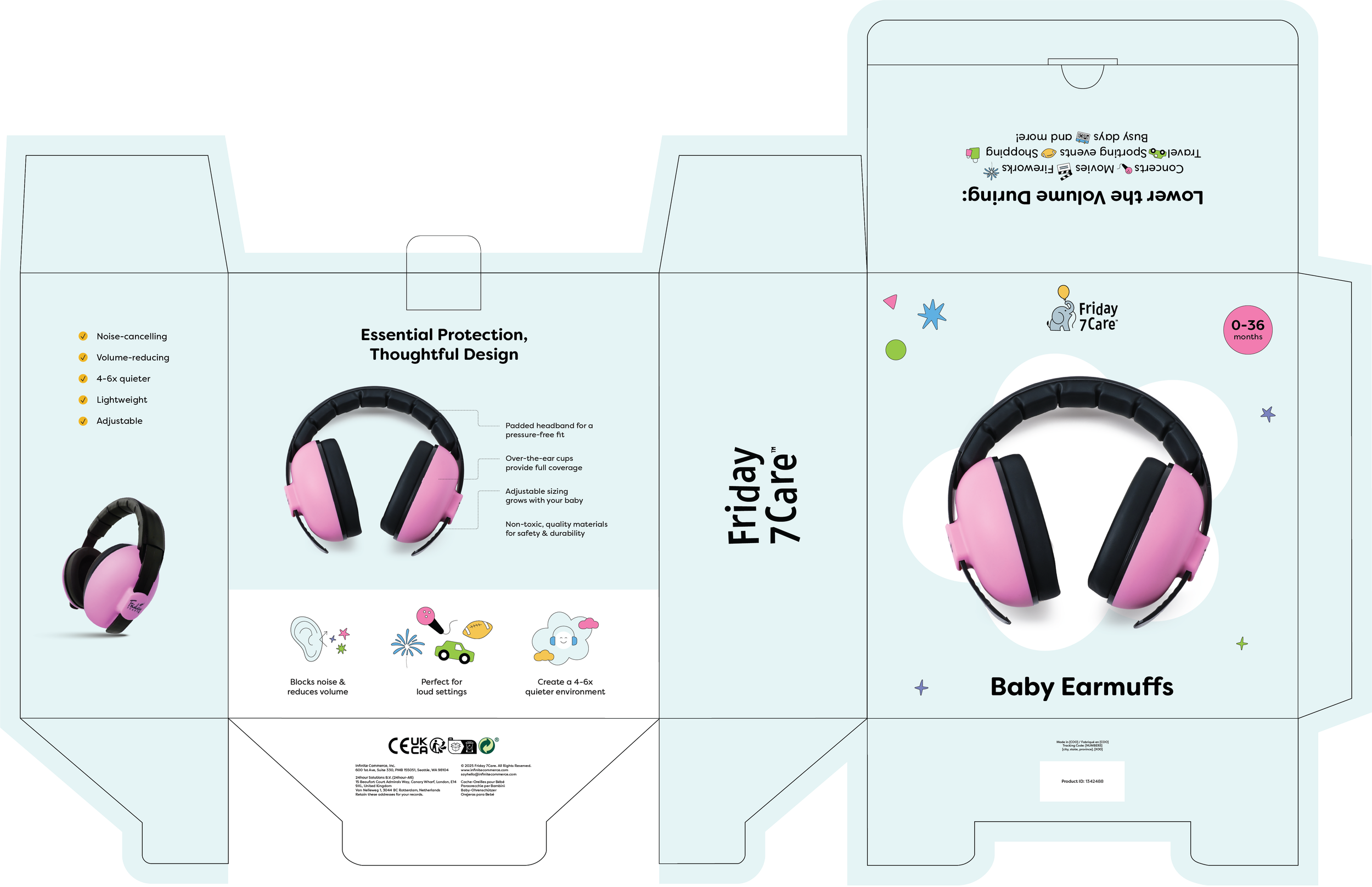
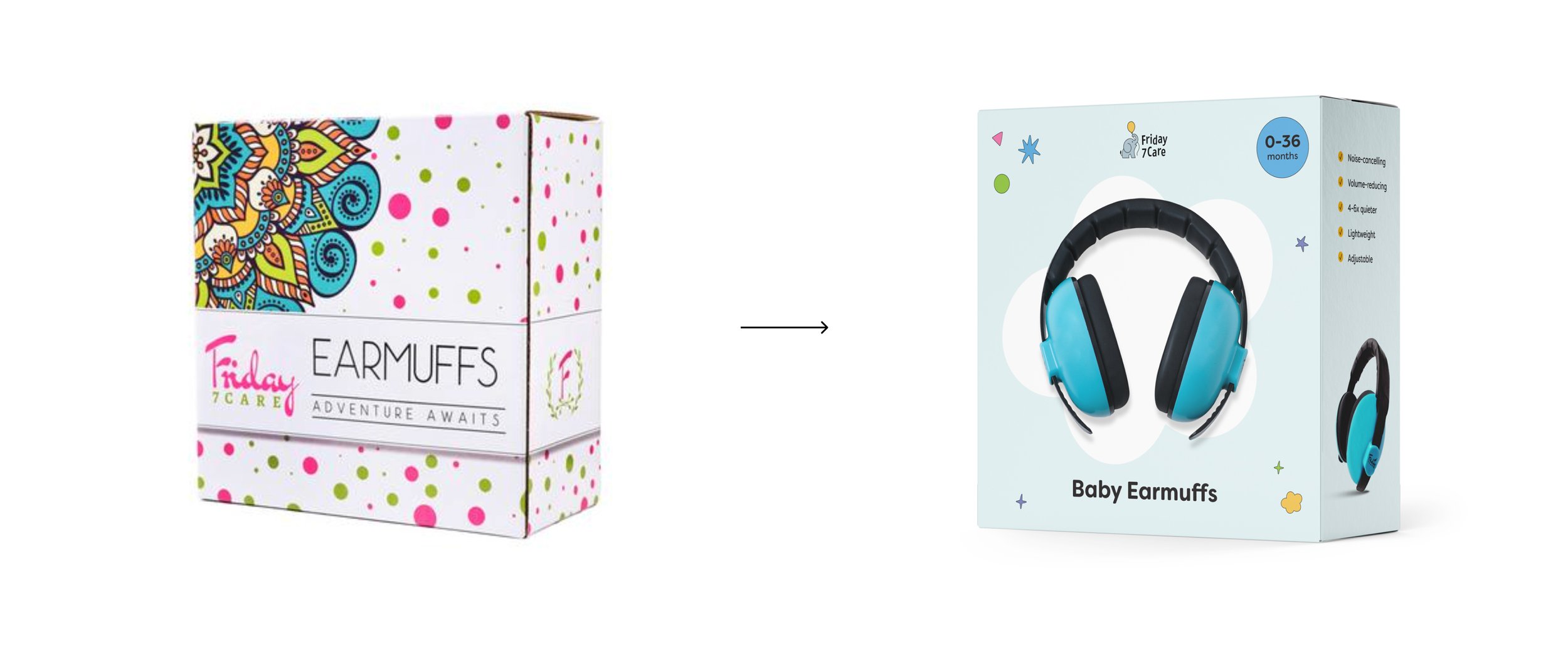
Previous packaging with unlicensed artwork on left, updated packaging that utilizes refreshed branding on right:
Amazon Brand Story:
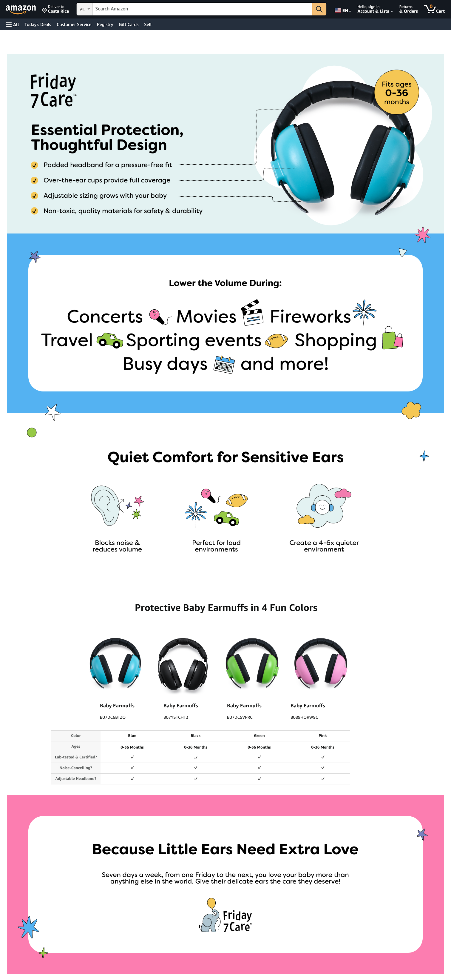
Selected Amazon A+ Content assets:
Friday 7Care Amazon Storefront: